

Background
The Pink Store is a leading Brazilian swimwear brand with over 15 years of success, known for its bold, feminine style that brings the vibrant spirit of Rio’s beaches to Israel.
Challenge
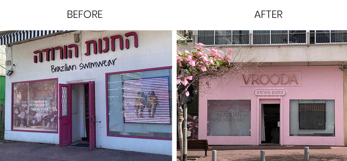
Despite its iconic local name, the brand needed a refresh to connect with a younger audience aged 15–25 and appeal to an international market. The goal was to create a modern, global identity while preserving the playful, free-spirited DNA that made the brand so beloved.
Solution
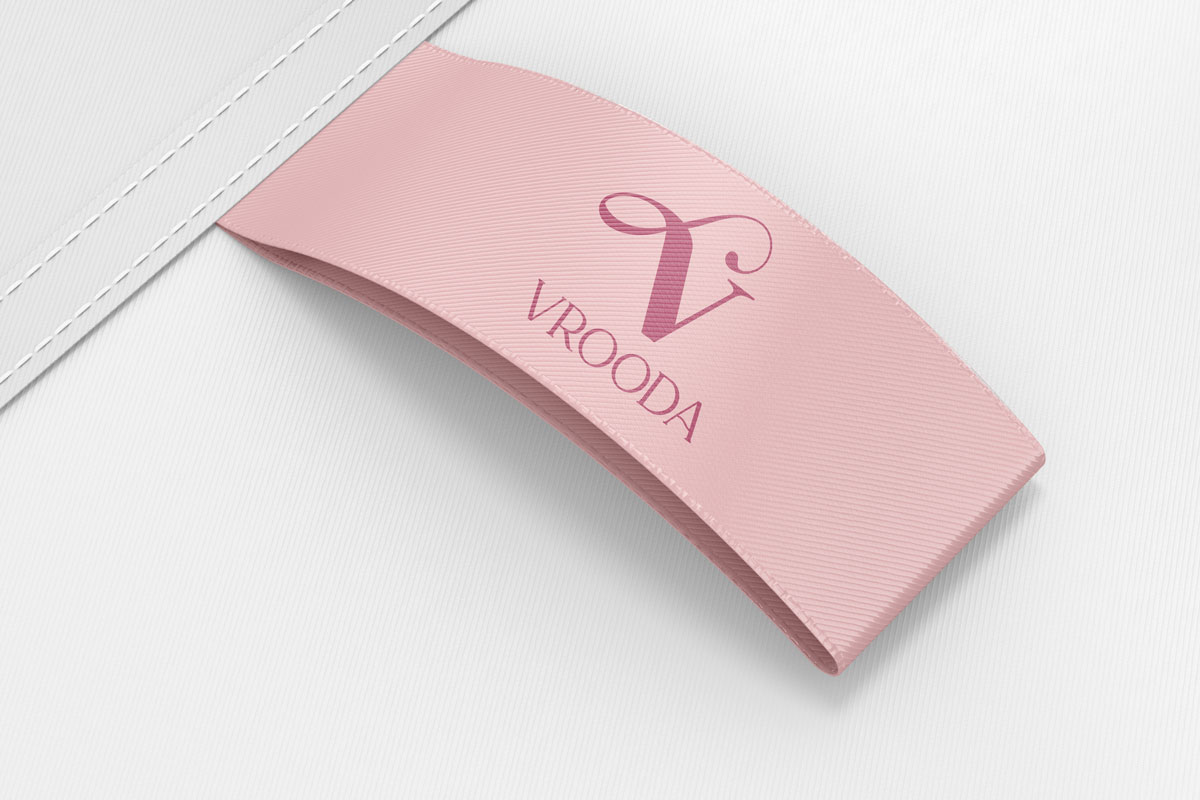
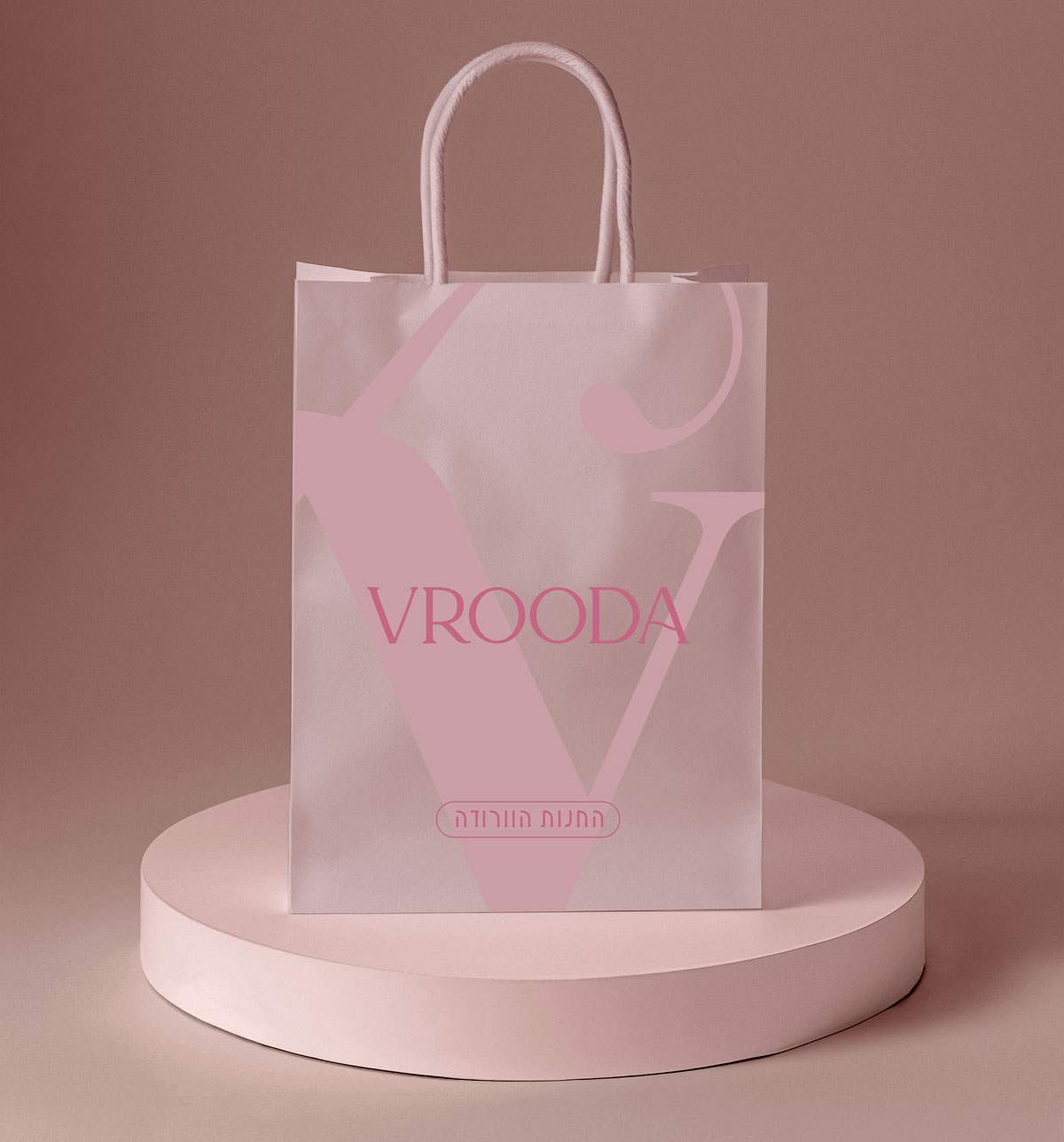
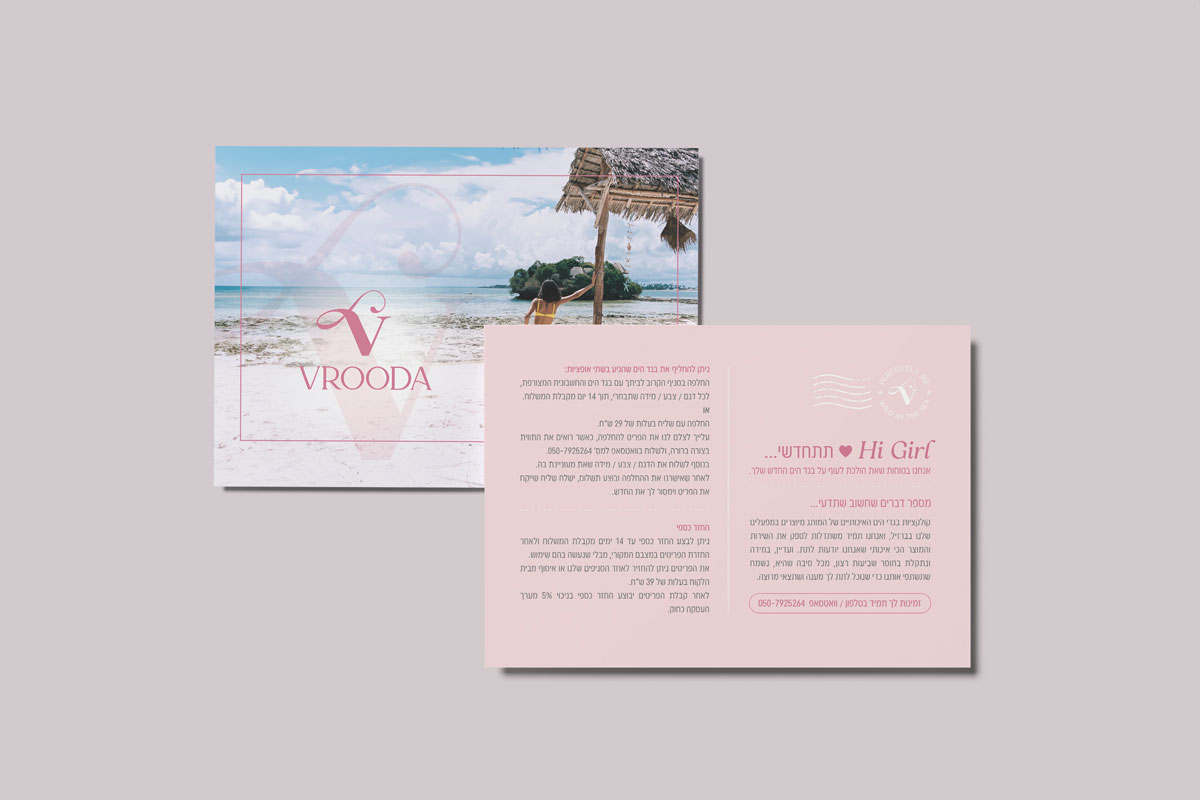
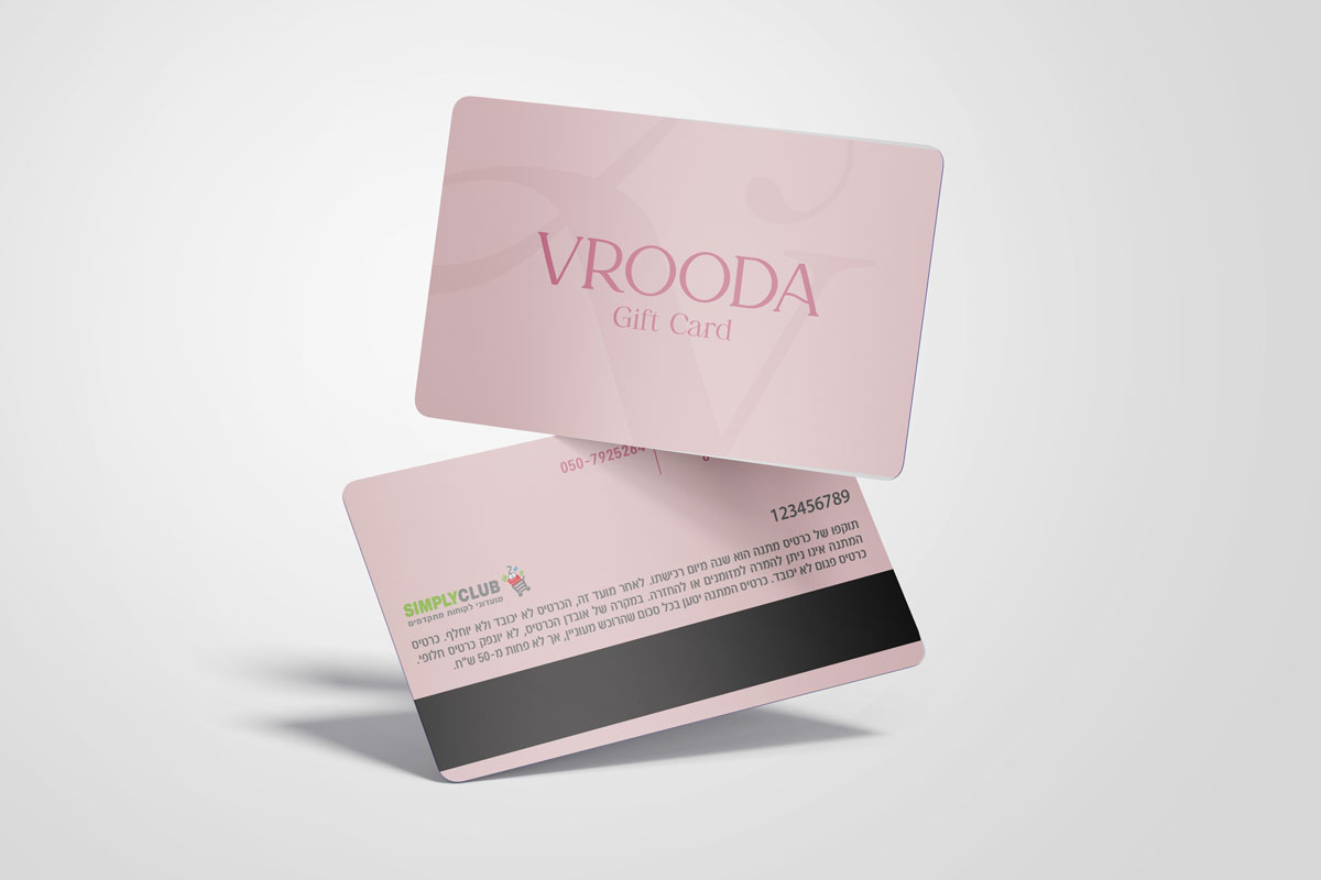
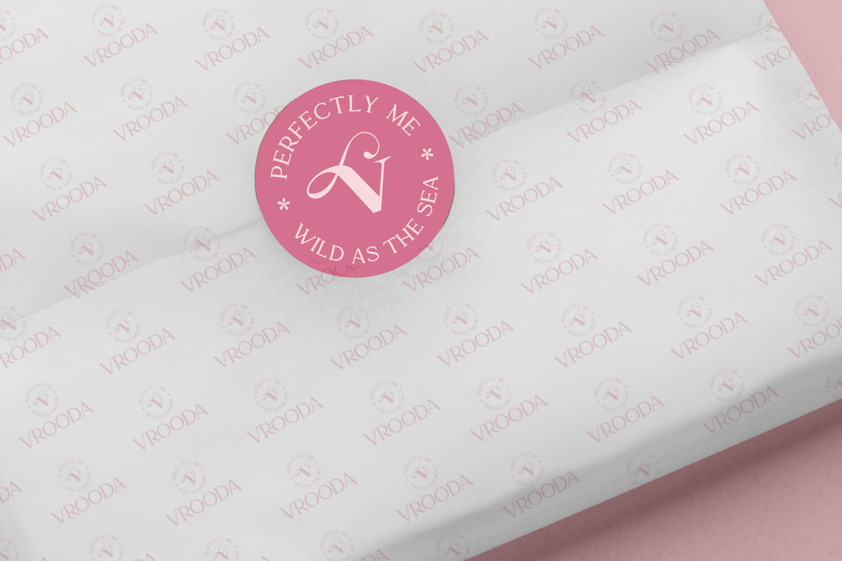
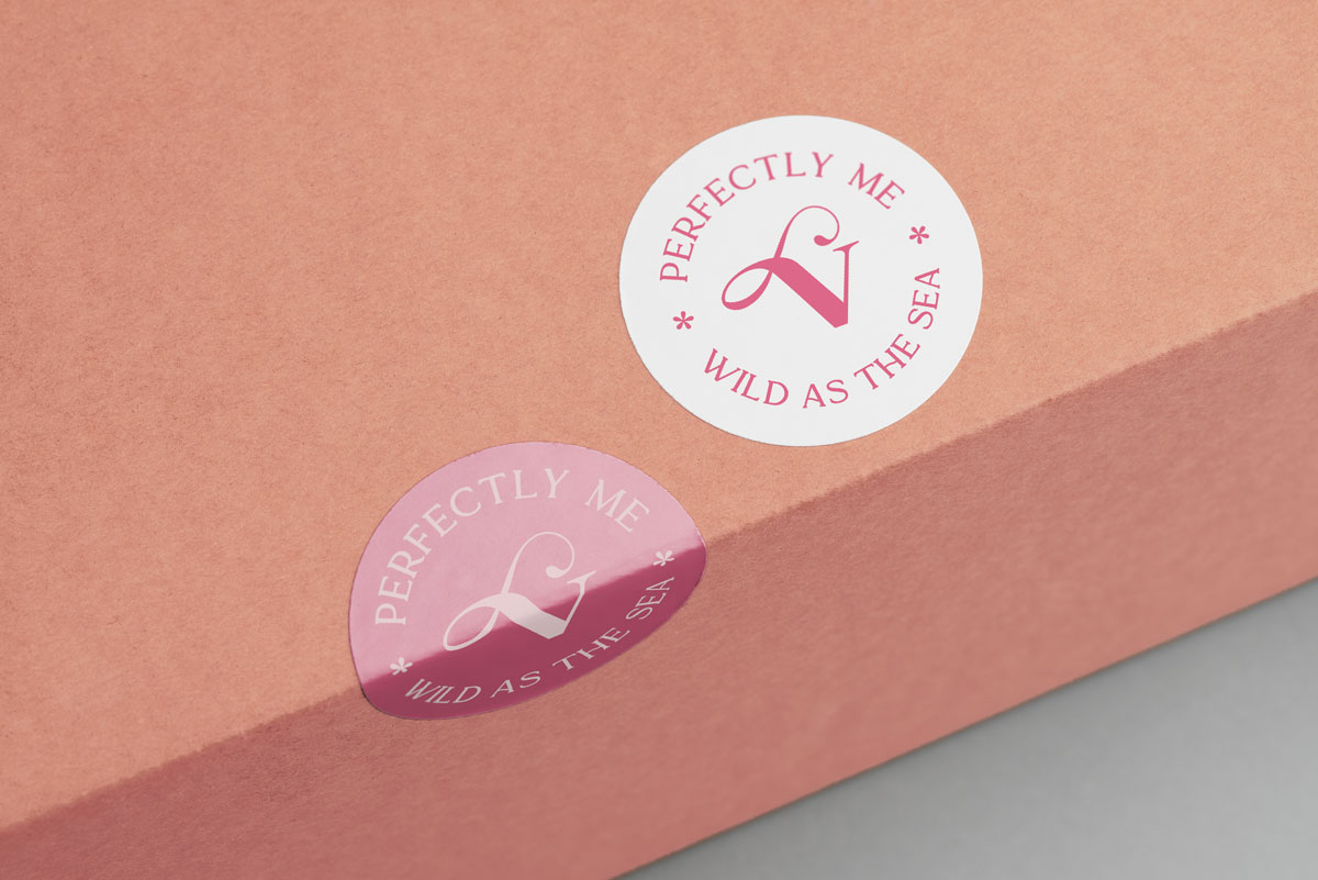
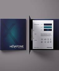
We led a complete rebranding that transformed The Pink Store into Vrooda—a name that feels contemporary and international. At the heart of the new identity stands a V-shaped logo, crafted with soft, flowing lines that symbolize femininity and the graceful form of the female body.
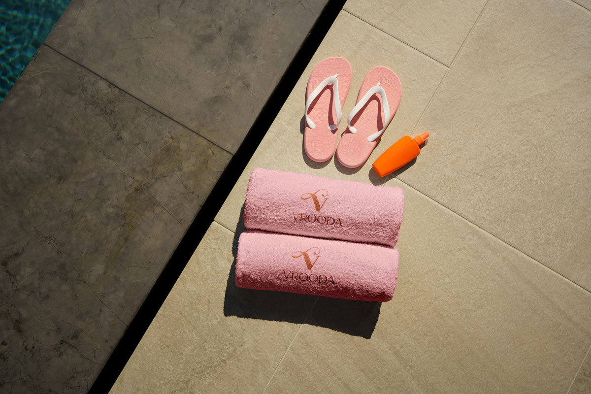
The rebrand continued with redesigned storefronts for both locations, featuring a fresh graphic language and chic pink palette to draw in a young, style-driven audience. We extended the brand experience through custom wrapping paper, branded shopping bags, stylish labels, and a distinctive metallic accent integrated into the beach bags, adding a touch of luxury and Instagram-ready charm.
The result is Vrooda—a brand that bridges local roots and global appeal, retaining the playful, carefree essence of the original while presenting a bold, fashion-forward, and unmistakably feminine identity.