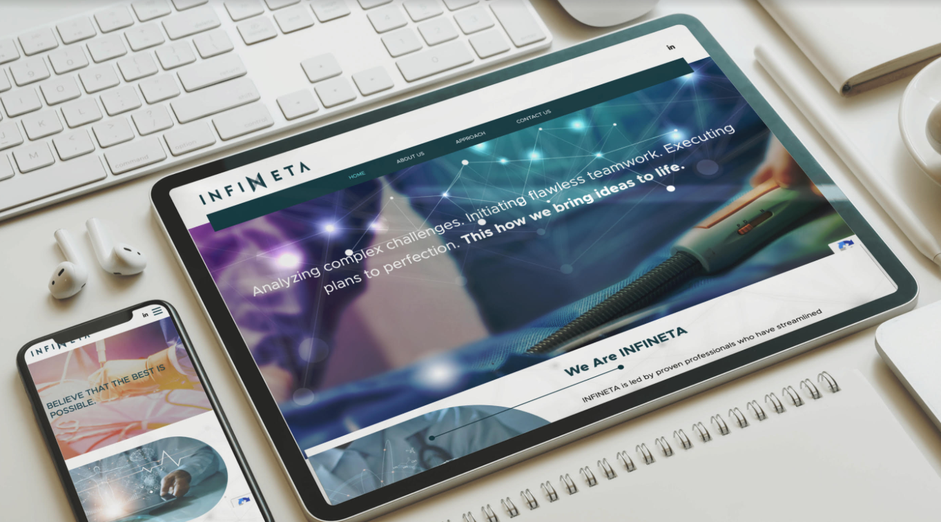
Background
Infineta provides medical device companies with lean process management that enables them to overcome a multitude of regulation, R&D, and budget barriers.
Our challenge
Our challenge was to build a brand that shows its extensive knowledge throughout the years even though they are a new company.
Our solution
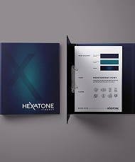
We started with developing the brand language that included the joining of their unique approach to business management, project management, concept r&d, and q&a, which is all projected in the letter N
Showing the joining and the infinity motion.
We chose a font that is bold strong and modern in the dark blue color to portray a strong company’s abilities.
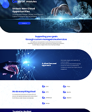
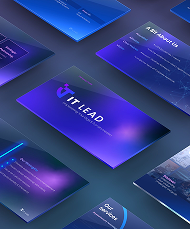
After establishing a brand language we continued to the company presentations and company website.
The website was designed with an innovative, clear medical look and feel, especially for the target audience of angel investors, VC’s, startups, and global companies.
The outcome was very innovative, and clean and hit the mark with the story we were telling about this creative company.