
Visual Concept | Cover Design | Graphic Language & Page Template Design
Background
Between the Sights is a documentary and emotional project telling the personal stories of reservists who experienced the war from within. Each photograph is accompanied by a personal story and an audio piece, together creating a human portrait of people living through an extraordinary reality.
The Challenge
The challenge was to create a visual language for a book about war without making it feel like a war book. The design needed to respect the emotional power of the photography and personal stories, while bringing them together into one coherent experience.
The Solution
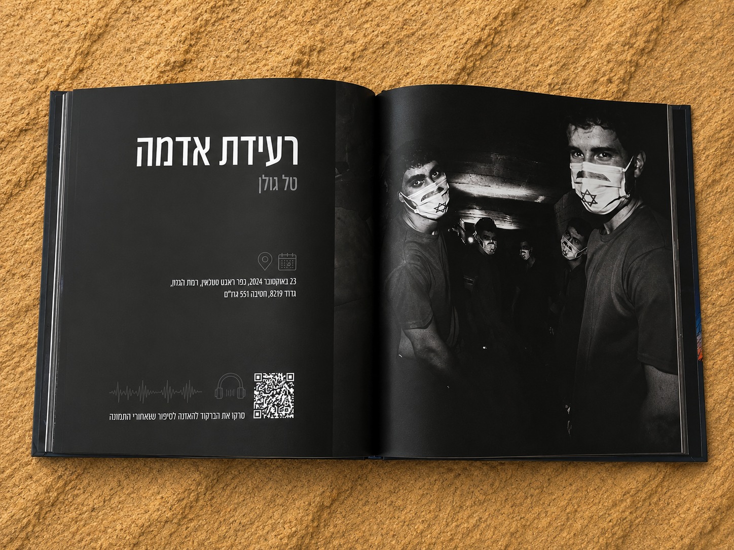
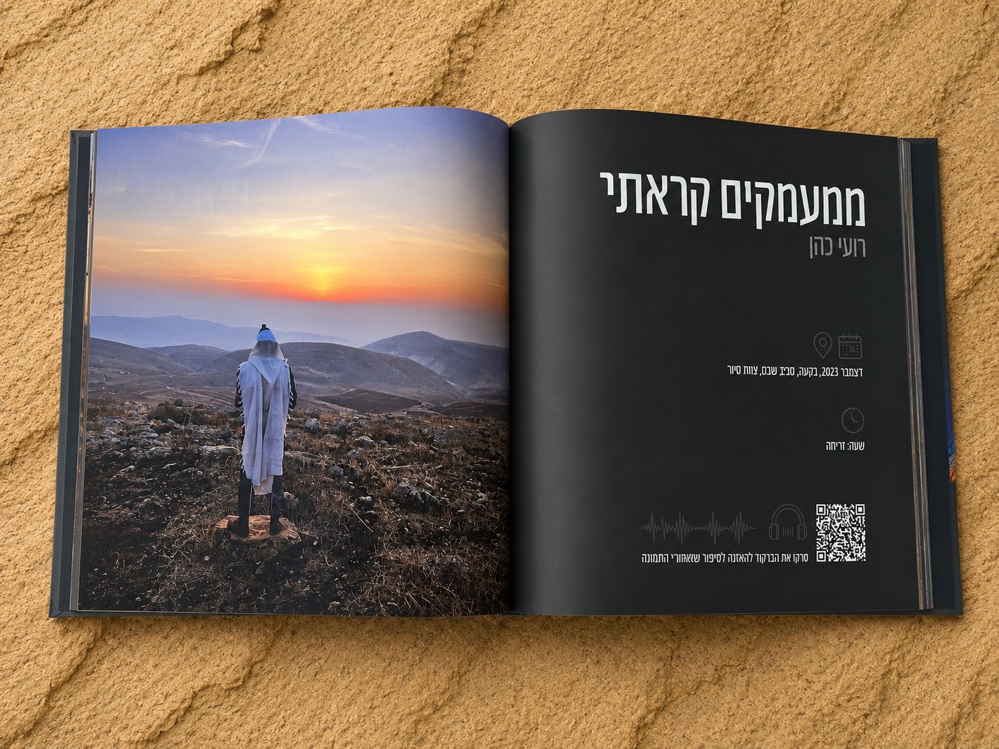
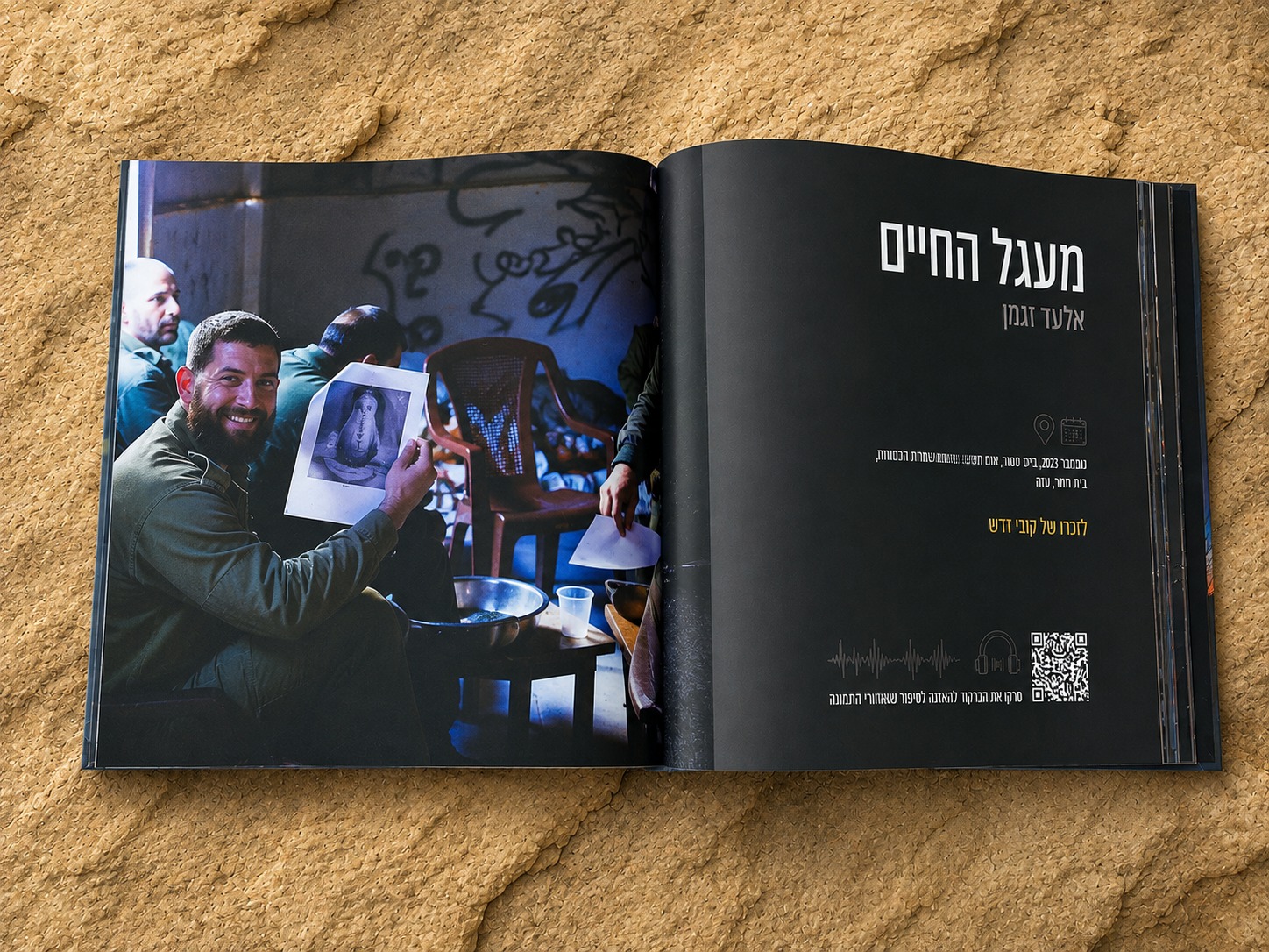
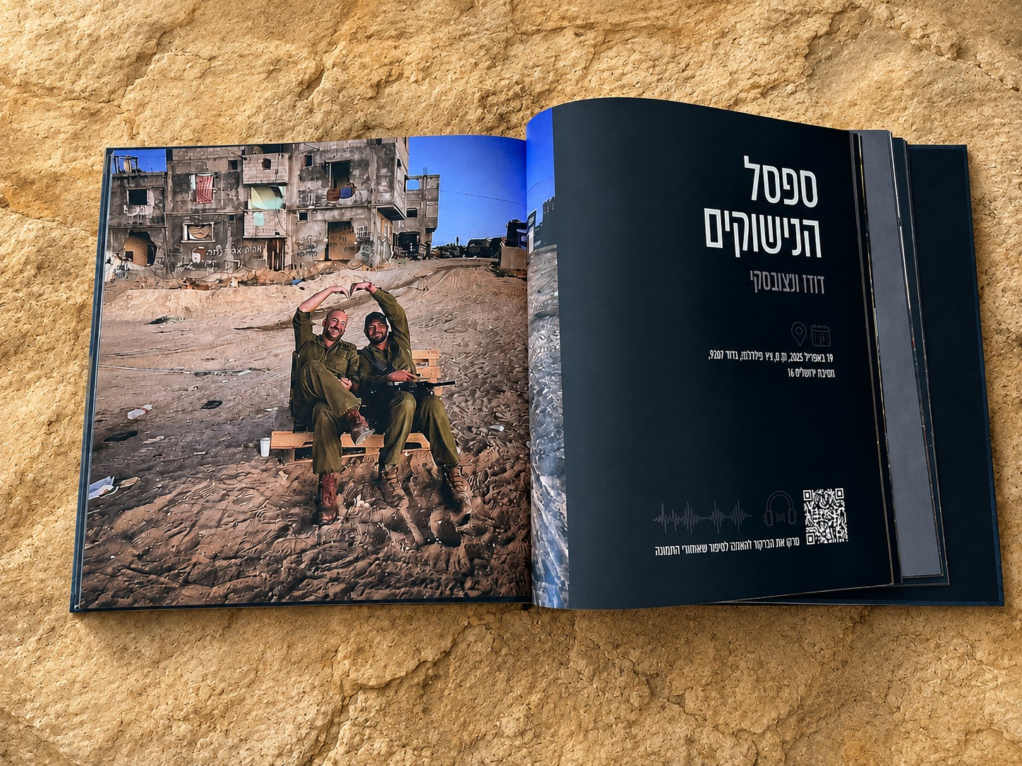
We developed the book’s visual concept, from the cover design to the graphic language and page templates. The design system was intentionally clean and restrained, allowing the photography and personal stories to take the lead while creating a consistent framework throughout the book.
The cover image was chosen as a direct interpretation of the title, Between the Sights. It captures several meanings of “between”: between two reservists, between the weapon and the person behind it, between war and life, and between night and day. The sunrise, at the transition from darkness to light, adds another layer of hope and continuity.
The figures appear almost as silhouettes, without a clear identity, allowing them to represent many people and many stories. It is the human moment between them, rather than a moment of combat, that captures the essence of the book: not the war itself, but the people living through it.
Between the Sights
“Between the Sights” is a documentary and emotional project that brings forward the stories of reservists who experienced the war from within. Each photograph is accompanied by a personal story and an audio excerpt, together creating a human mosaic of people living through an extraordinary reality.
The Challenge
The challenge was to create a visual language for a book about war without turning it into a war book. To give space to the power of the photographs and stories, preserve their sensitivity, and bring them together into one cohesive work.
The Solution
We developed the book’s visual concept, from the cover design to the graphic language and page layouts. We created a clean, restrained design system that allows the photography and personal stories to take the lead, giving each story the space and attention it deserves.
The choice of cover image was directly inspired by the title, “Between the Sights.” The image holds several layers of meaning: the space between two reservists, between the weapon and the person behind it, between war and life, and between night and day.
The moment of sunrise—the transition from darkness into light—adds a sense of hope and continuity.
The figures appear as silhouettes, almost without individual identities, allowing them to represent many. It is precisely the human moment between them, rather than a moment of combat, that captures the essence of the book.
Not the war itself, but the people living through it.