
Challenge:
Our main challenge in this project was to create a unique brand with language that would project the unique messaging of its core identities in various ways. The cyber industry is considered a conservative market, yet technologically it is very advanced.
Solution:
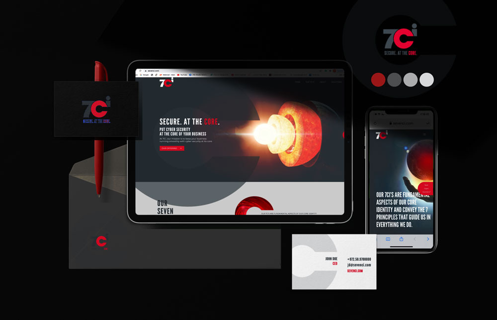
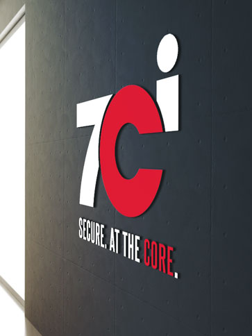
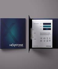
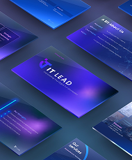
After understanding the uniqueness of this company and it’s 7 core identities, we developed the whole brand visual language around this concept, showing the core in various interesting ways. We created the brand style guide, power point templates, corporate stationery, additional web imagery and of course the whole creation was put into the company website.
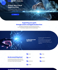
The website was given a clean, sharp look that makes very clear what the company’s solutions and core values are. We developed icons for all the various solutions continuing with the language of the c of the logo, The imagery chosen for the homepage was to show impact with the core in a very deep global way and we gave a very gentle shine that leads to their messaging. The rest of the imagery was chosen to give a business like look, with the core and red colors, in a consistent yet unique way.
The outcome was a very outstanding strong brand that shows it’s differentiation right from the first second!