Background
Dana and A is a powerhouse in human resource solutions, laser-focused on the construction and infrastructure sectors since 2016. They’re not just filling roles; they’re curating top-tier, experienced professionals and handling every aspect of their employment, from landing to site placement, offering clients an end-to-end, peace-of-mind experience. With legal work permits for up to 5 years, they’re setting the gold standard for workforce solutions, ensuring both quality and compliance.
Branding Challenge
Our design challenge was to create a brand that can deal with the dynamics of the constantly changing market, while at the same time conveying professionalism and quality of personnel.
Solution
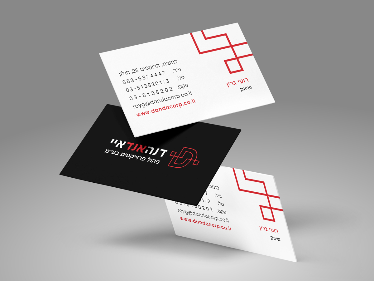
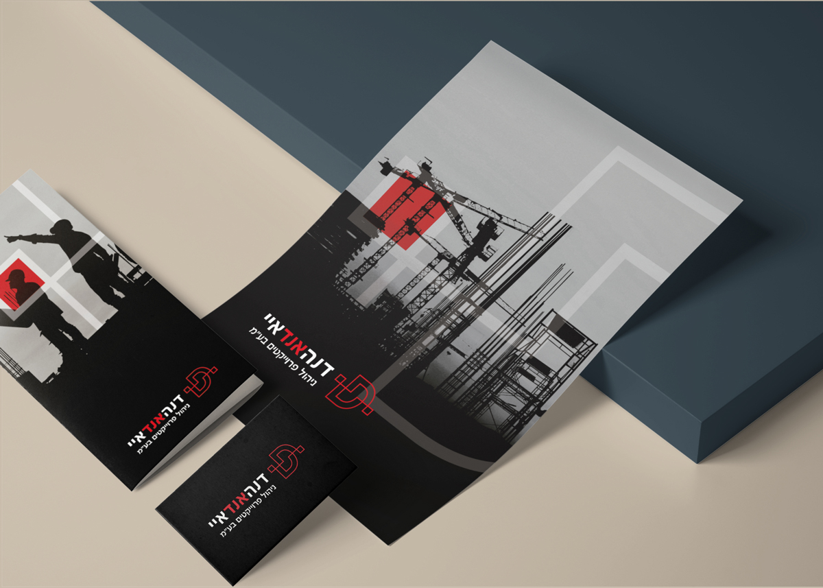
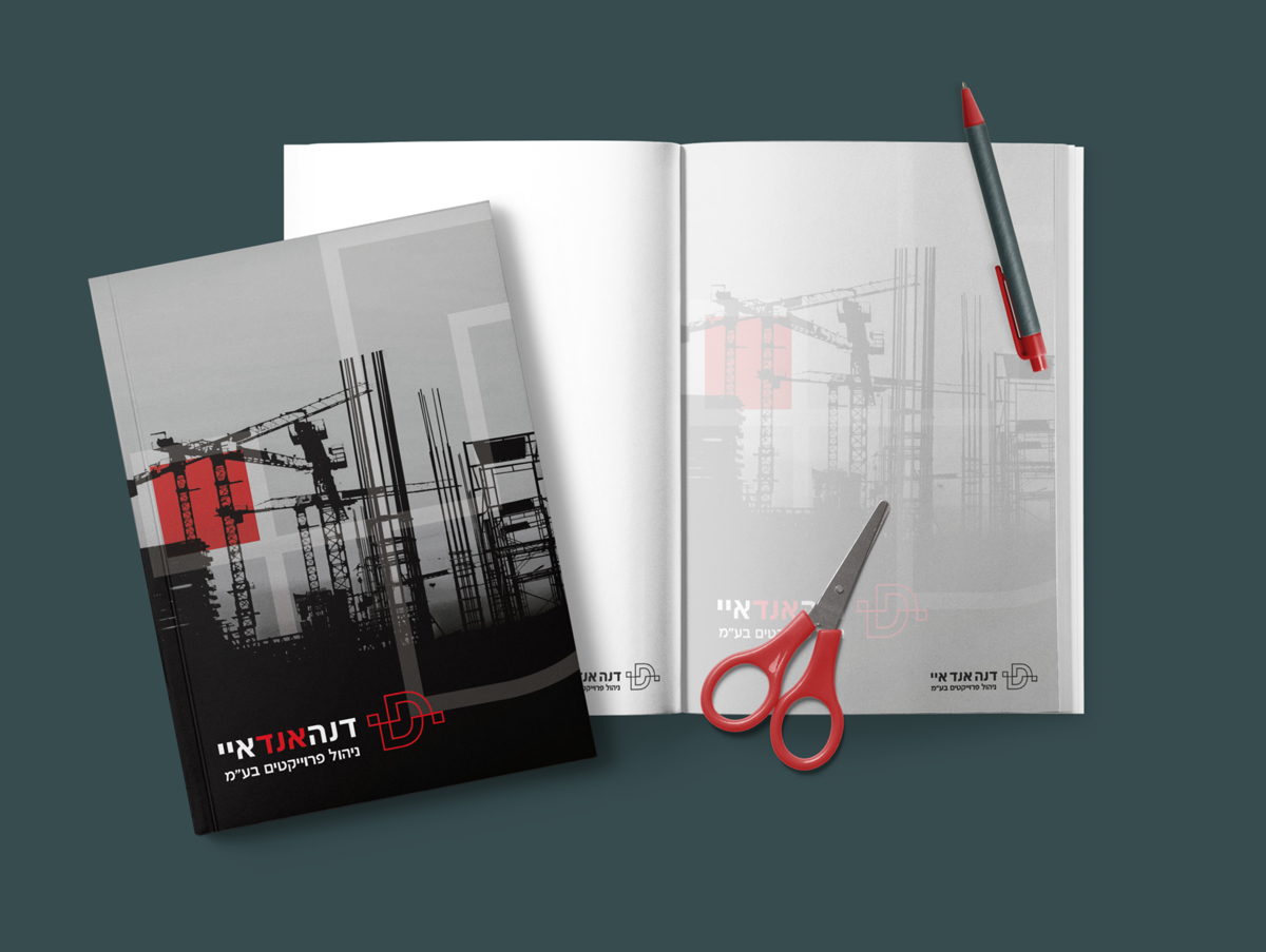
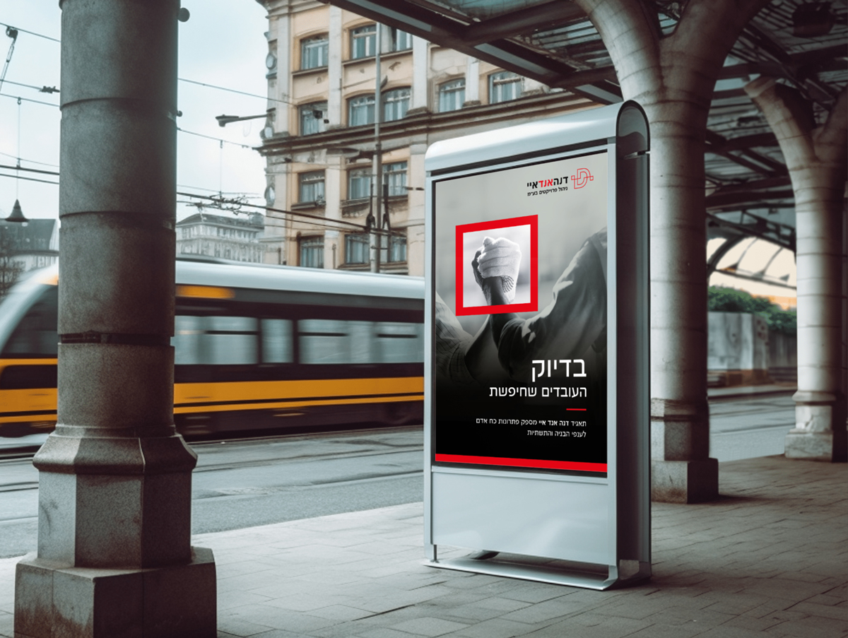
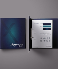
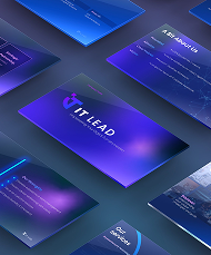
We created a strong and professional brand identity, with a strong and striking coloration compared to the competitors.
A symbol of the letter D expresses connection, precision and service.
We have developed various up-to-date icons for the various types of professions and updated the company profile.
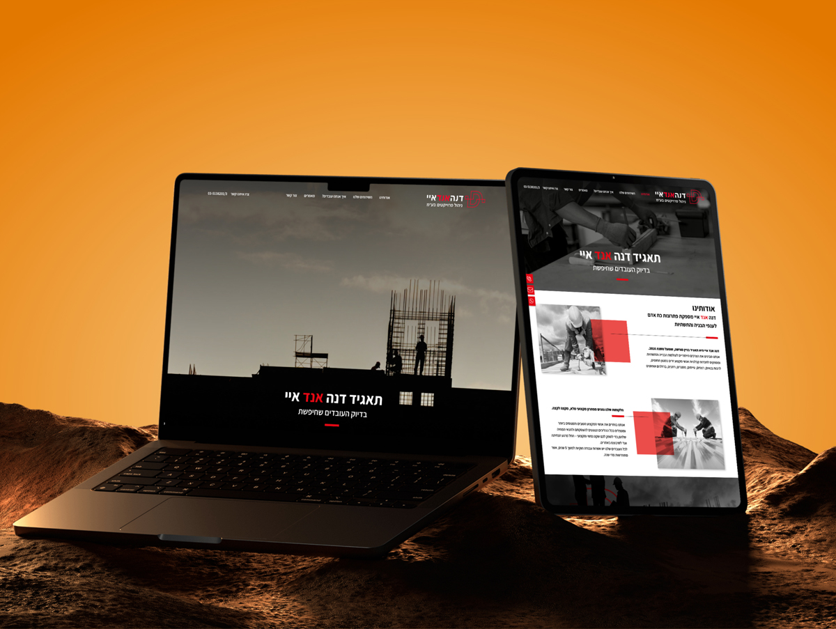
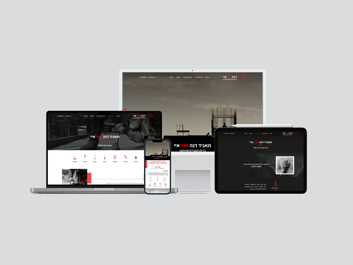
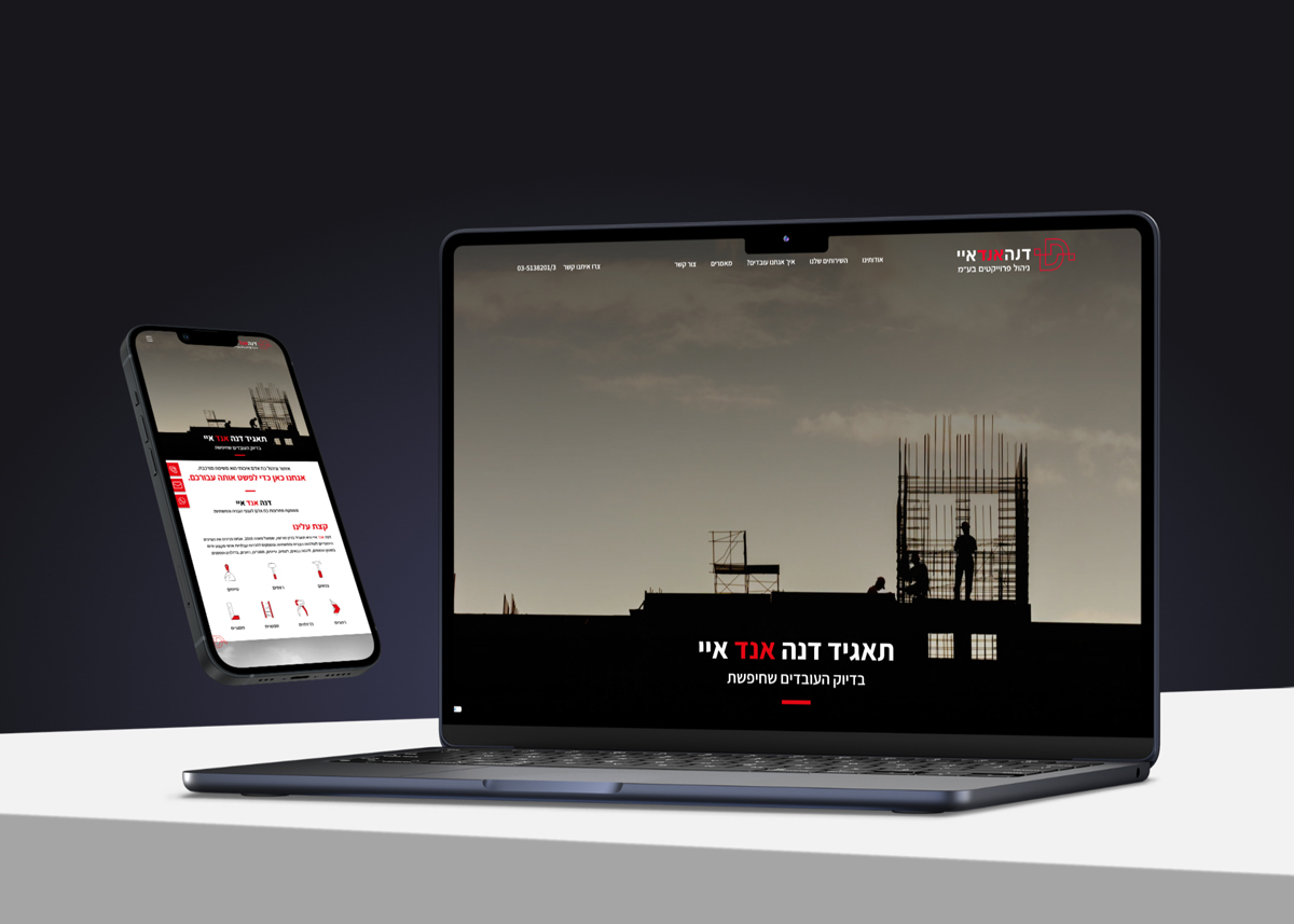
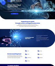
The newly designed website is a digital masterpiece that serves as a continuation of the brand’s values. It is not only visually beautiful; It is a functional, user-centric platform built to guide the client effortlessly through the world of quality HR solutions.