

background
A start-up investment company in the field of Hospitality.
Our challenge
Our main challenge was to build a brand that would portray
Confidence, solidity but at the same time a bringing a fresh HiTech experience.
The solution
The concept we developed was the bird’s eye view that is the future vision of the company
The investments and outlook of the company’s vision, it is reflected in several ways:
First, in the symbol, we developed a step in which the concept of the shield inspires security along with the bird flight.
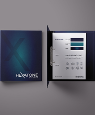
The color palate we chose was Royal Purple along with the vibrant blue that allowed a feeling of dynamics and freshness.
The images selected for presentations and marketing materials were images chosen as the bird’s eye view with colors that are most known in the areas of investment with
the atmosphere of vacation we wanted to convey.


